Website sections:
- Services Provided
- IT Project Management
- Application Development
- Creativity Management
- Previous Work Experience
- Site Map
- Contact Information
Current section's content:
- Overview of Current Focus and Previous Work Experience
- Creativity Management Method Development Project
- Previous Work
- Overview of the Previous Work
- Achieve More with Less Effort
- Market Research Tools
- Marketing, Prospecting and Sales Tools
- Resource Scheduling Tools
- Event Planning Tools
- Project Planning, Development and Management Tools
- From Search Functionalities to Multi-Functional Report Centers
- Reports
- Data Entry, Uploading and Filtering Tools
- Application Navigation and Usage Assistance Tools and Features
- Artistic and Entertaining Nuances: Brighten the Moments!

Application Navigation and Usage Assistance Tools and Features
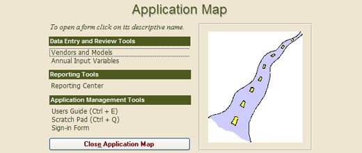
Having only one way for navigating a database application may create problems for the users who prefer other navigation methods over the available one. I try to keep the navigation structure flexible, providing several options to accommodate for different user preferences. Accordingly, an application can contain the following navigation features:
- Switchboard that displays all the main user interfaces but does so in sections.
- Application Map that can be opened, using a shortcut (like Ctrl+D), and allows navigating from any user interface to any other user interfaces.
- The direct access buttons that provide direct access from one user interface to another.
- Datasheet buttons that launch datasheets that display simultaneously more data than the main forms do.
- Navigation Assistance Form, a small pop-up form, that opens when user interfaces are launched that do not contain navigation buttons (datasheet type of forms and reports).
- Further, users can navigate to another already opened user interface by selecting it from a drop-down box that is located in the top row on the computer screen.
Navigation Assistance Form, Datasheet buttons and the direct access buttons are usually set up so that they leave other user interfaces open, while the Application Map closes all the open user interfaces except the Switchboard. So, when a user finds that he or she has too many user interfaces open, the user can press a shortcut key and open only that user interfaces that is currently needed.
The applications that I put together usually also contain application usage assistance tools and features. The users can learn how to use the application on their own by using its Users Guide. When a shortcut (usually Ctrl+E) is pressed, the Users Guide opens and displays instructions for the currently or most recently displayed used user interface. These features, when combined with training, lead to reduced learning curves, which increase the total value of the application.
Further, user interfaces can also be set up so that all the buttons display messages about their functionality. This feature is a toggle that switches the "button learning mode" on and off.
Additionally, I usually build in features that check the users work and launch warning messages when the application user may be making a mistake, or is about to do something that is not reversible.
My most advanced application usage assistance tools are based on Computer-Optimized Creative Development Method and can, for example, help the application users to do project planning and carry the plans to successful completion. Such tools work equally well regardless of the project type. Other tools based on the same concept provide user interfaces where the user can ask how to perform application usage-related tasks.

